Cumulative Graph – What it is and How to Get Real-time Workflow Visibility from Cumulative Diagrams

Understanding the Cumulative Flow Diagram
A cumulative flow diagram (CFD) is a type of cumulative graph widely used in Agile project management methodologies such as Scrum and Kanban. It provides a comprehensive visualization of work-in-progress (WIP) stages, task flow, and project progress. The CFD is an essential tool for Agile teams to monitor, optimize, and improve workflows effectively.
The core purpose of a CFD is to track and represent tasks across different workflow stages, such as “Backlog,” “In Progress,” and “Completed.” The diagram features colored bands, with each band representing a distinct stage of the workflow. These bands provide a clear visual snapshot of the number of tasks in each stage at any given time.
One of the standout advantages of the CFD is its ability to highlight bottlenecks. When a particular band widens over time, it indicates tasks are piling up in that stage, signaling inefficiencies or potential blockers. For example, if the “In Progress” stage shows significant widening, it suggests tasks are stuck or resources are inadequate, requiring immediate attention. Conversely, a narrowing band suggests an improved workflow, where tasks are moving efficiently.
Additionally, CFDs are effective for measuring progress. By analyzing the cumulative total of completed work, ongoing tasks, and remaining work, Agile teams can gain actionable insights into their project status. It also helps them predict delivery timelines and ensure their efforts align with project goals.
In Agile methodologies like Kanban, the CFD ensures workflow stability and enables teams to maintain consistent progress. Unlike traditional linear tracking methods, CFDs accommodate dynamic changes within the project, such as shifting priorities or scope adjustments. This adaptability makes CFDs indispensable for teams managing complex projects with overlapping tasks and dependencies.
Moreover, cumulative flow diagrams aid in resource optimization. By visualizing the entire workflow, team leaders can allocate resources more effectively, ensuring that no stage is overburdened while others remain idle. This balancing act is crucial for maintaining steady throughput and reducing delays.
Overall, the cumulative flow diagram is a powerful tool that fosters transparency, accountability, and collaboration within Agile teams. It empowers teams to identify areas for improvement, streamline workflows, and deliver value more predictably.

Example of Cumulative Graph
Imagine tracking the daily sales performance of a retail store. A cumulative graph might display:
- Daily sales on the x-axis.
- Cumulative revenue on the y-axis.
For example, if Day 1’s revenue is $500 and Day 2’s revenue is $700, the cumulative graph will show $500 for Day 1 and $1,200 for Day 2. This continuous accumulation allows stakeholders to:
- Spot seasonal sales trends.
- Analyze the total revenue growth.
- Identify any dips in sales performance.
How to Read a Cumulative Frequency Graph?
To effectively interpret a cumulative frequency graph:
- Understand the Axes:
- The x-axis represents the data range (e.g., time, age, sales).
- The y-axis shows the cumulative frequency or total.
- Locate Key Points:
- Identify peaks, plateaus, or sharp increases.
- Note any flat sections indicating periods of stagnation.
- Analyze Trends:
- A steeper slope suggests rapid progress or accumulation.
- A flatter line indicates slow or no progress.
Learning to read these graphs is vital for extracting actionable insights and optimizing processes.
Cumulative Diagrams and Kanban – How Are They Related?
Kanban, a popular Agile framework, uses cumulative diagrams to:
- Visualize workflows and task statuses.
- Monitor work-in-progress (WIP) limits.
- Identify bottlenecks in the process.
In a Kanban board, the CFD represents tasks as they move through columns such as To-Do, In Progress, and Done. Teams rely on these diagrams to:
- Ensure task flow efficiency.
- Avoid overburdening team members.
- Enhance overall project predictability.
The Agile cumulative flow diagram ensures that teams maintain a consistent workflow, reducing inefficiencies and improving delivery timelines.
How Does a Cumulative Flow Diagram Work?
A cumulative flow diagram operates by providing a visual representation of how tasks progress through various stages of a workflow over time. This diagram ensures that teams can track their work efficiently and identify areas requiring attention or improvement.
1. Tracking Tasks Across Stages
Tasks are categorized into different workflow stages, such as “Backlog,” “In Progress,” and “Completed.” The progression of tasks through these stages is tracked and updated regularly. For Agile teams, this tracking mechanism allows them to see the exact distribution of tasks at any point in time, helping them maintain control over the workflow.
2. Plotting Data Points
Each stage’s data is recorded daily or at regular intervals, and cumulative totals are calculated. These data points are plotted on the graph, forming colored bands that represent the accumulation of tasks in each stage. For instance, the “Backlog” band shows all tasks waiting to be addressed, while the “Completed” band reflects the total number of finished tasks.
3. Visualizing Workflow
The graph’s colored bands serve as a visual representation of task distribution across stages. A narrowing band, such as “In Progress,” indicates reduced WIP, signaling efficiency improvements. On the other hand, a widening band in the same stage suggests inefficiencies or bottlenecks requiring attention. By interpreting these patterns, teams can identify workflow disruptions early and take corrective actions.
4. Ensuring Workflow Consistency
In Agile methodologies, particularly Kanban and Scrum, the cumulative flow diagram helps ensure that tasks flow smoothly through the system. The Agile cumulative flow diagram is dynamic, adapting to changes like priority shifts or unexpected delays. This adaptability ensures that teams can continuously align their workflow with project goals.
5. Identifying and Resolving Bottlenecks
One of the key benefits of the CFD is its ability to highlight bottlenecks. If tasks accumulate in one stage, it creates a widening effect in the corresponding band, signaling that the team needs to allocate additional resources or remove blockers to address the issue. This proactive resolution prevents delays and keeps the project on track.
6. Predicting Delivery Timelines
By analyzing the slope and width of bands, teams can estimate project completion times. Steeper slopes in the “Completed” band indicate faster task completion rates, while flatter slopes suggest slower progress.
In summary, a cumulative flow diagram is a versatile tool that promotes transparency, identifies inefficiencies and enhances collaboration in Agile project management. It provides a clear and actionable roadmap for maintaining an efficient and balanced workflow, ensuring that projects are delivered on time and within scope.
What Are Cumulative Diagrams Used For?
Cumulative diagrams are versatile tools with applications across various industries and domains. Their primary purpose is to provide a visual representation of cumulative progress, enabling stakeholders to analyze trends, identify inefficiencies, and make data-driven decisions. Here are some key areas where cumulative diagrams are extensively used:
1. Agile Project Management
Cumulative diagrams, particularly cumulative flow diagrams, play a critical role in Agile methodologies like Kanban and Scrum. They help teams:
- Visualize task distribution across different workflow stages such as Backlog, In Progress, and Completed.
- Monitor work-in-progress (WIP) limits to ensure smooth task flow.
- Identify bottlenecks by analyzing widening bands in the diagram.
- Predict delivery timelines and maintain consistent progress.
Agile teams rely on these diagrams to improve collaboration, optimize resources, and enhance workflow efficiency, ensuring timely delivery of projects.
2. Sales Analysis
In the sales domain, cumulative diagrams are invaluable for tracking performance metrics such as:
- Cumulative revenue growth over a specified period.
- Progress toward sales targets or quotas.
- Identification of seasonal trends or dips in sales performance.
By providing a clear visual of cumulative sales trends, businesses can make informed decisions about marketing strategies, resource allocation, and customer engagement initiatives.
3. Educational Research
Educational institutions and researchers use cumulative diagrams to represent:
- Student attendance records over time.
- Performance trends in cumulative test scores or grades.
- Progress in curriculum coverage or course completion rates.
These diagrams enable educators to track student progress effectively and identify areas where additional support or intervention may be needed.
4. Manufacturing
In the manufacturing sector, cumulative diagrams are essential for monitoring production processes. They help:
- Track cumulative production output and identify delays or disruptions.
- Monitor inventory levels and ensure supply chain efficiency.
- Visualize the flow of raw materials and finished goods through the production pipeline.
By identifying bottlenecks and inefficiencies, manufacturers can optimize their operations and reduce lead times.
5. IT and Software Development
Cumulative diagrams are also widely used in IT and software development to:
- Track bug resolutions and software testing progress.
- Monitor feature development and deployment timelines.
- Ensure balanced workloads across development teams.
These diagrams provide actionable insights that help teams prioritize tasks, address issues proactively, and meet project deadlines effectively.
In conclusion, cumulative diagrams are adaptable and powerful tools that cater to a wide range of industries. Whether used in project management, education, sales, or manufacturing, they offer clarity, transparency, and actionable insights to drive efficiency and success.
Cumulative Graphs vs. Burndown Charts
Both cumulative graphs and burndown charts are an important part of project management. Sometimes project teams confuse both these flow representations owing to the similarities in their representation. Let us look at the key differences between these two workflow representations.
| Feature | Cumulative Graph | Burndown Chart |
|---|---|---|
| Focus | Cumulative progress over time | Remaining work over time |
| Usage | Tracking accumulation (e.g., tasks, sales) | Visualizing project completion rates |
| Goal | Optimize workflow efficiency | Predict project completion timelines |
| Visualization Style | Adds up values cumulatively | Declines as tasks are completed |
While both tools are valuable, cumulative graphs offer a more comprehensive view of data accumulation, while burndown charts focus on the reduction of pending tasks.
Benefits of Using a Cumulative Flow Chart
- Workflow Transparency:
- Provides a clear view of task statuses across various stages.
- Bottleneck Identification:
- Highlights areas causing delays for quick resolution.
- Process Optimization:
- Enables teams to fine-tune workflows and improve efficiency.
- Improved Decision-Making:
- Facilitates data-driven strategies by showcasing trends and progress.
- Better Resource Allocation:
- Ensures balanced workloads by visualizing task distribution.
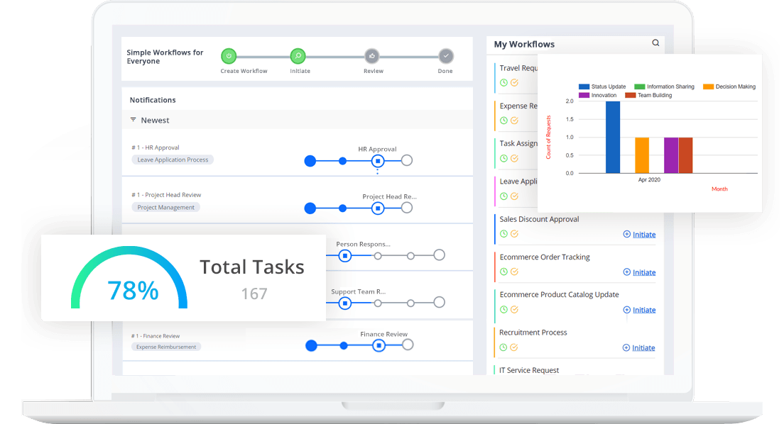
A workflow automation solution like Cflow builds automated workflows based on cumulative flow diagrams. Cflow’s workflow automation tool enhances cumulative flow chart management by automating task tracking and generating real-time insights.
Final Thoughts
Cumulative graphs, particularly cumulative flow diagrams, are indispensable tools for teams aiming to track progress and optimize workflows. By offering detailed insights into task stages, these graphs empower Agile teams to identify bottlenecks, enhance efficiency, and improve project predictability. For businesses seeking to simplify workflow management, tools like Cflow provide automated solutions to leverage the full potential of cumulative flow diagrams. Start transforming your project management processes with Cflow today!
FAQs
Q1. What is a cumulative flow diagram used for? A cumulative flow diagram is used to visualize workflows, monitor work-in-progress, and identify bottlenecks in Agile project management.
Q2. How does a cumulative flow diagram benefit Kanban teams? Kanban teams use cumulative flow diagrams to ensure smooth task flow, maintain WIP limits, and enhance overall efficiency.
Q3. How is a cumulative graph different from a burndown chart? While a cumulative graph tracks data accumulation, a burndown chart focuses on the reduction of remaining tasks over time.
Q4. What industries benefit from cumulative diagrams? Industries such as IT, manufacturing, retail, and education leverage cumulative diagrams for task tracking, process optimization, and performance analysis.
Q5. How can Cflow help with cumulative graphs? Cflow automates workflow tracking, generating real-time cumulative flow diagrams to improve task management and decision-making.
What should you do next?
Thanks for reading till the end. Here are 3 ways we can help you automate your business:

Do better workflow automation with Cflow
Create workflows with multiple steps, parallel reviewals. auto approvals, public forms, etc. to save time and cost.

Talk to a workflow expert
Get a 30-min. free consultation with our Workflow expert to optimize your daily tasks.

Get smarter with our workflow resources
Explore our workflow automation blogs, ebooks, and other resources to master workflow automation.